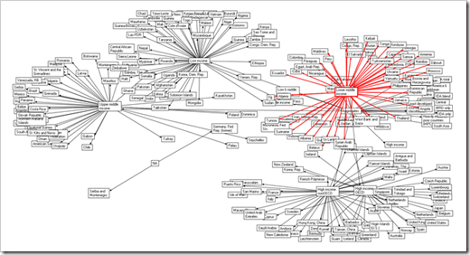
Mix PowerShell, some Would Bank data and a little NetMap and you get… Some cool data visualizations…
Development in a Blink - Using PowerShell and World Data (now a public API) with Microsoft’s NetMap free graphing libraries
“…
The World Bank’s first API offers 114 indicators from key data sources and 12,000 development photos. We are releasing this API because we believe this information can be mapped, visualized and mashed up in an unlimited number of ways that will help develop a better understanding of trends and patterns around key development issues.Visualize the Data with PowerShell and NetMap
I posted on Microsoft Research .NetMap and PowerShell. This script visualizes countries by Income Level, Lending Types and Regions.
…
Income Level
…”
I thought this was a pretty cool mashup of neat tech, taking some raw data, accessing it via PowerShell and then visualizing it with NetMap.
I still think I can/should use NetMap for “something.”
(PowerShell Team Blog - OMG - Check This Out (Data Visualization with PowerShell))
Related Past Post XRef:
.NetMap – Using Excel, or embedded control, to graph and visualize connections, networks (social), degrees of separation, associations, etc


1 comment:
Hey Greg,
thanks for "the other way round". I am using the MS Mind Manager to create a Mind Map for my projects. Now I can compare the plannings with the outcomes.
Post a Comment