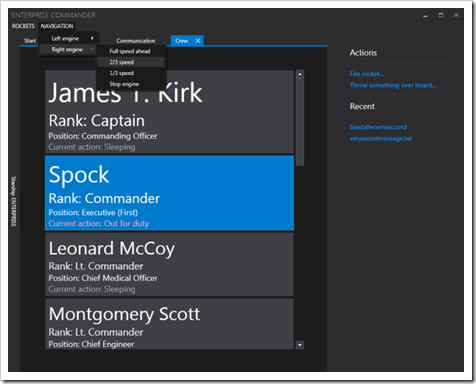
Like the new VS2012 UI style? Here's how you can use like styles in your WPF app..
CodeProject - Visual Studio 2012 Metro Styles for WPF
Contents
Introduction
Although there are still serious discussions about whether the "Metro" design concept from Microsoft is good or not, WPF developers, who follow the trend, may now write their styles keeping the concept in mind. But despite the fact that many people think about the Tile Wall of Windows 8, when they hear the word "Metro", the concept itself actually means much more than that. The main idea is to keep things simple. No more gradients, no more colorful, blinking, glassy, flashing surfaces. One of the applications demonstrating this concept best is, no doubt, the new Visual Studio 2012. This article will present some Visual Studio like WPF styles.
"Styles like visual studio" means, that I didn´t copy the styles of course (using a decompiler or something) and so they aren´t actually equal, but I used the same colors and I structured my demo application like VS. I will discuss some of the main differences later.
Screenshots
First some screenshots of what we´ll end up with, to show you what I´m talking about:
..."
Love them, hate them, tolerate them, I still think this community driven VS2012 WPF styles project/download cool...


No comments:
Post a Comment